We generally find that the most popular image orientation for property photography is landscape: It lends itself to showing off breadth of rooms and the scope of interior space. We also find that many web platforms tend to prefer it. This means, however, that sometimes we can miss out on shots that lend themselves to portrait: namely corridors, stairways or narrow spaces.
So we've recently got around this by introducing our split-screen shots: Two portrait photos placed side by side to create a landscape-sized image, but allowing us to show off every aspect of the property. A nice side effect of this is how aesthetically pleasing two images can look next to each other, especially when they either match or deliberately contrast in some way.
Here are some of our favourite split-screen shots from the last few months.
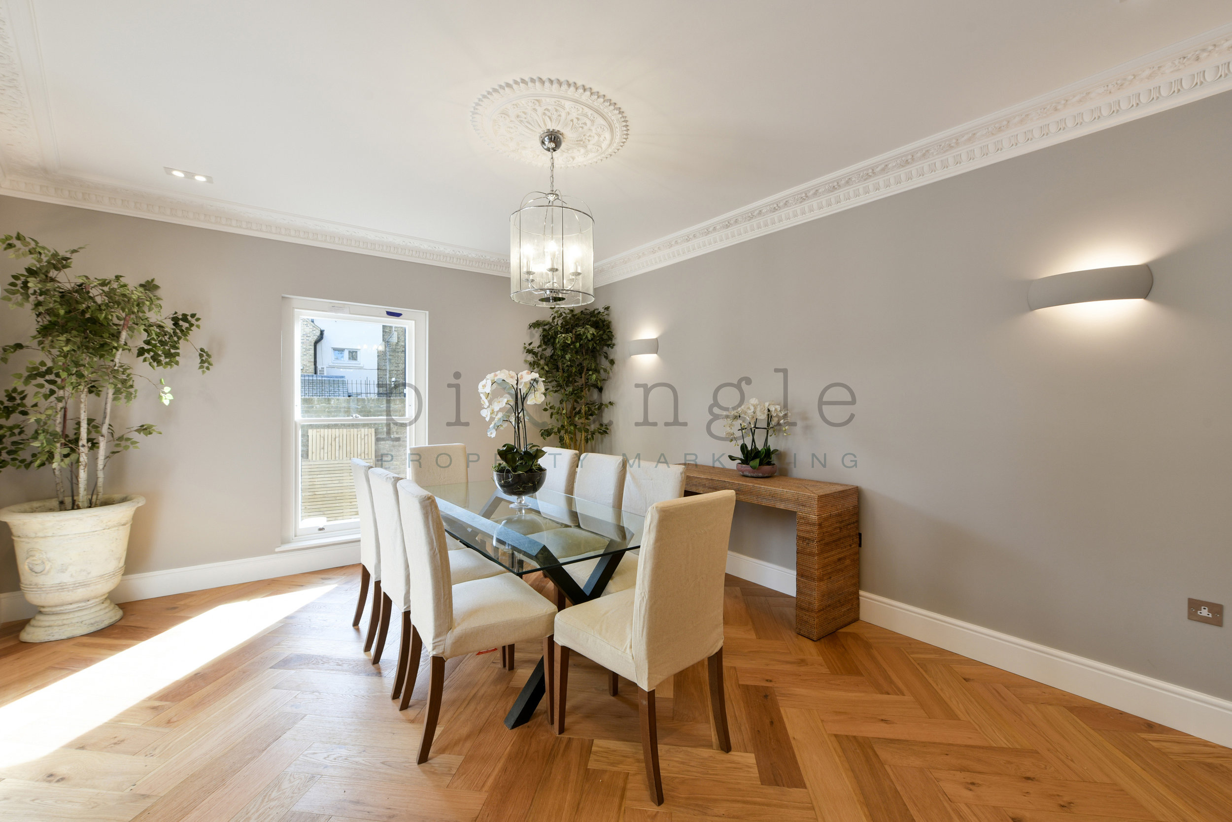
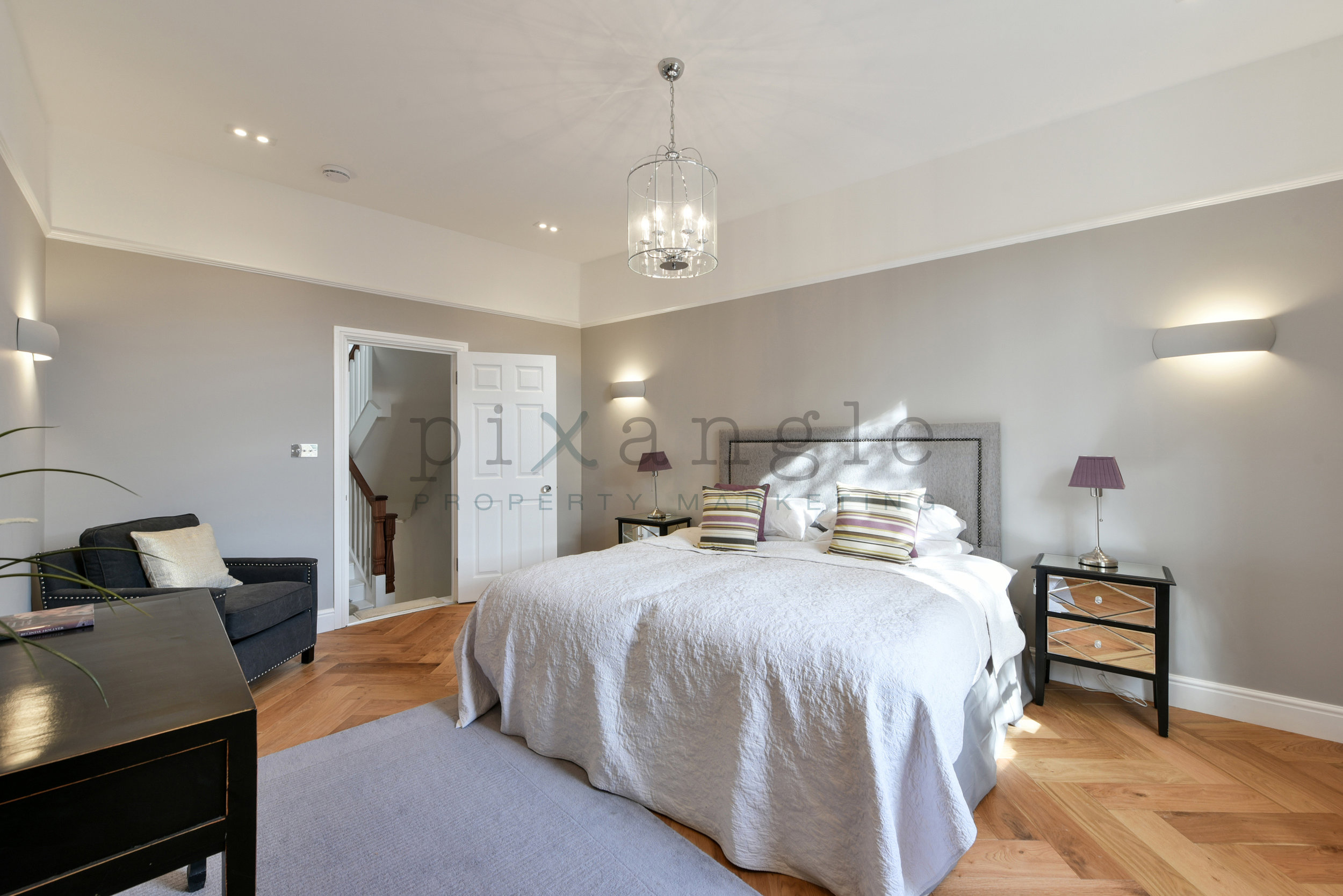
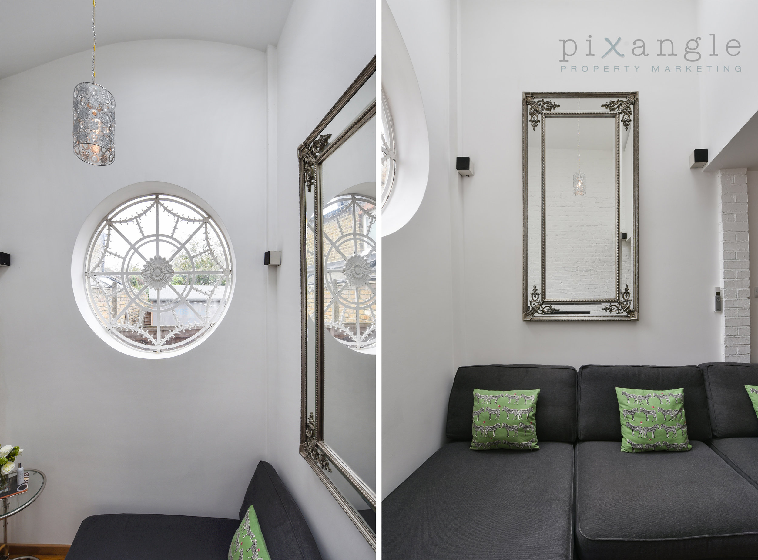
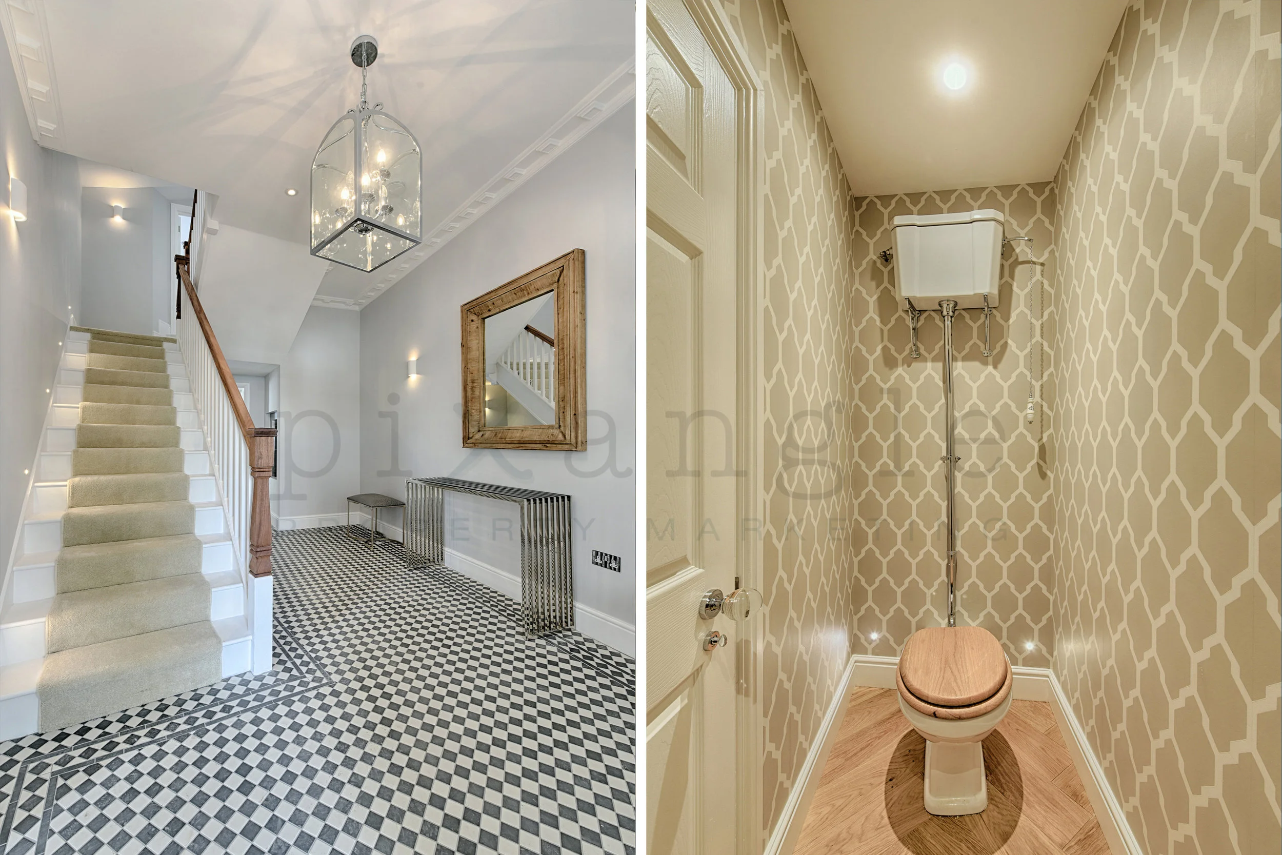
1. Ooooh, the serenity. A beautifully renovated and refurbed house, this place had such beautiful interior design and decor, thanks to The Haywoods Group, that there were plenty of opportunities for feature shots. Of course we needed to show off those gorgeous floor tiles, but the portrait nature of the shot on the right meant we were able to show both the bed, and how well the light fitting and its ceiling rose above complemented it.
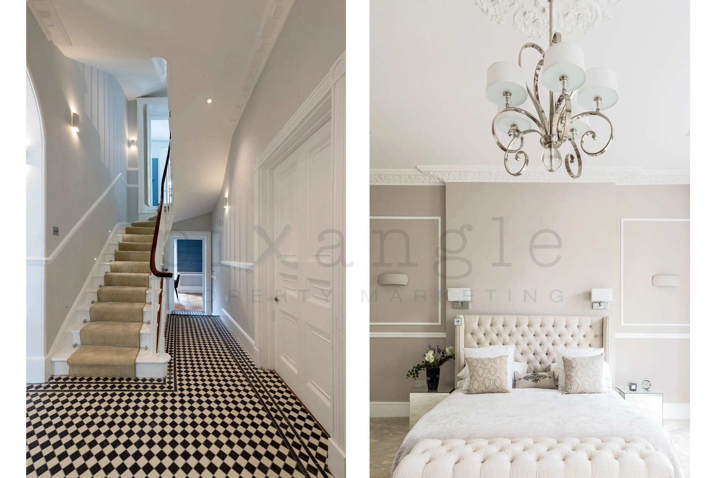
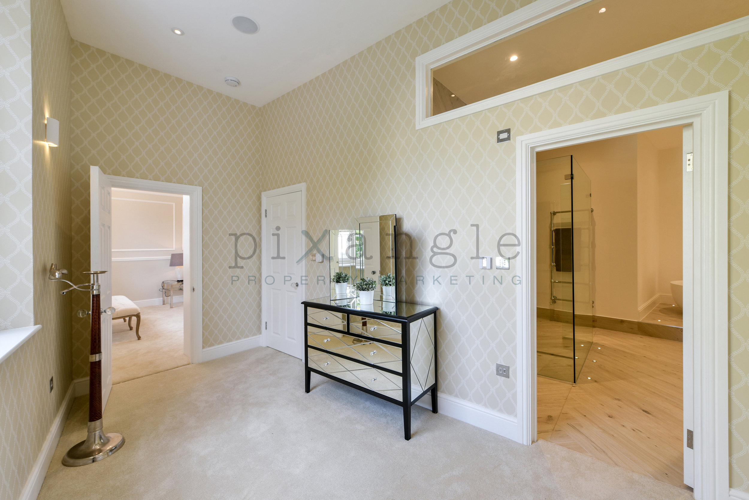
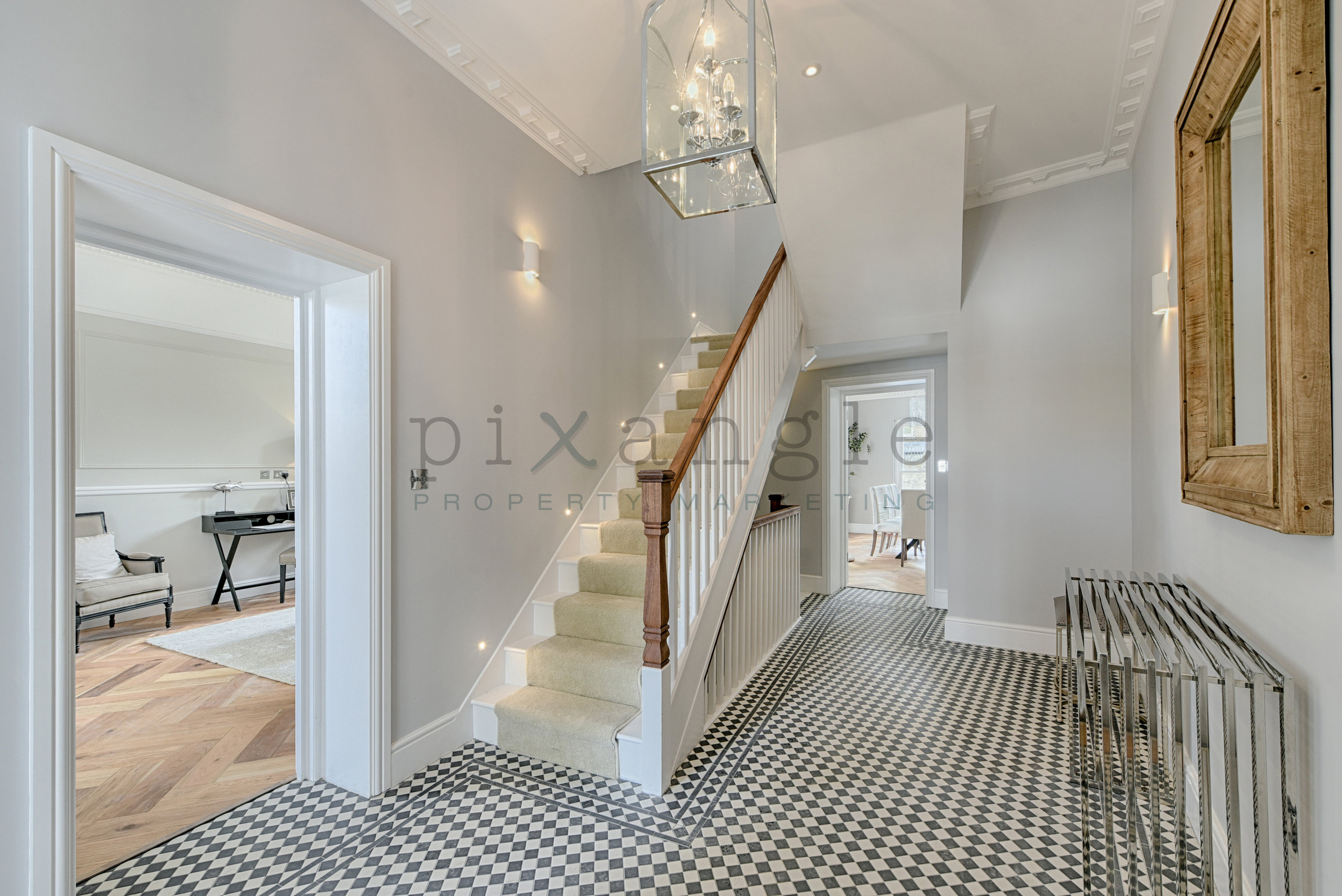
2. And this property was its next door neighbour. While those spectacular hallways are probably perfectly shootable as landscapes, the shot on the left is another example of the portrait orientation enabling us to include the light fitting, showing off the whole floor-to-ceiling feel. In this instance the height of the ceiling (in excess of 3m) meant that a large, dramatic light fitting wasn't overbearing.
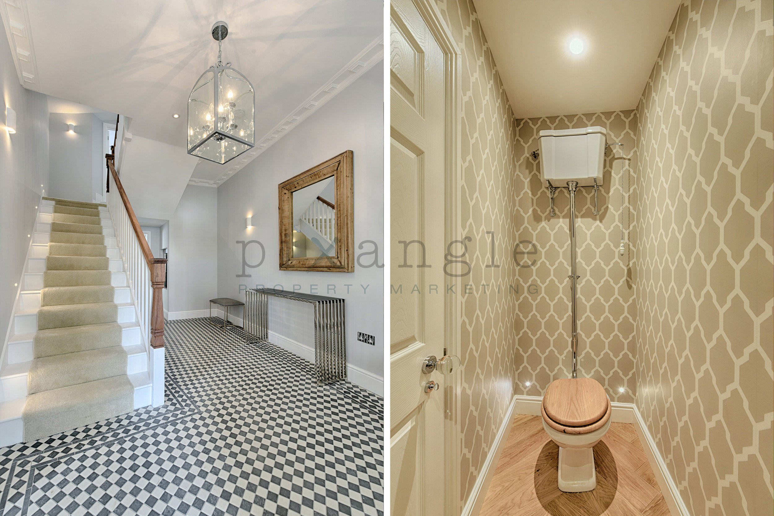
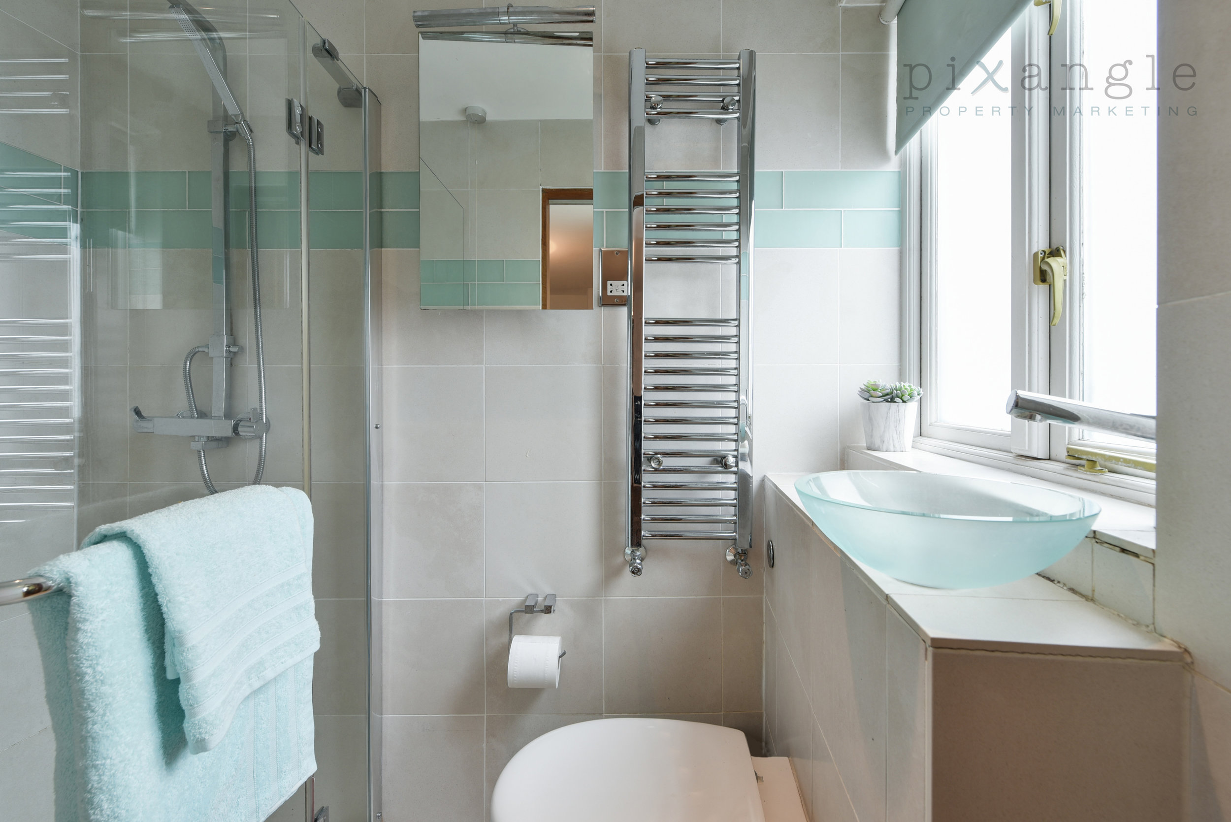
The shot on the right is a typical example of when landscape just doesn't cut it: The width of the lavatory room is only about 1m, so in portrait you just get far too much wall. This way, the shot is far more proportionate.
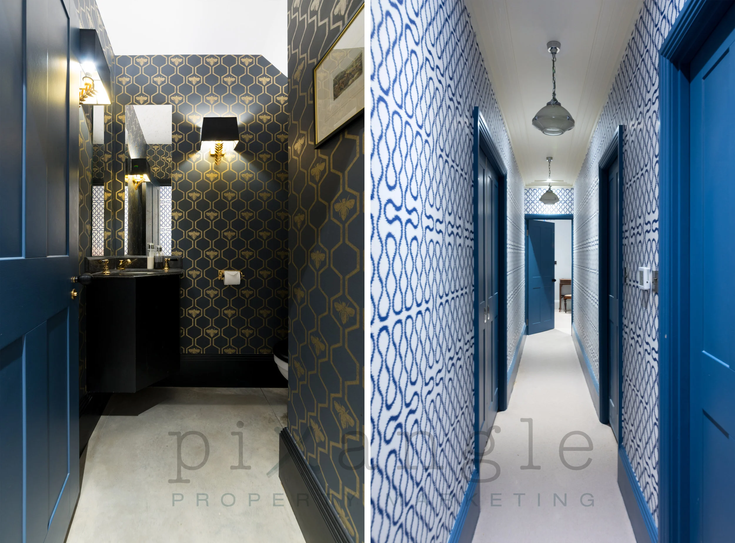
3. Moving on to bright and bold colours! We love how the two vibrant shades of blue complement each other. It's lovely to be able to show off the pattern of the wallpaper in these corridors, too.
While we're on the subject, how do we feel about those light fittings?
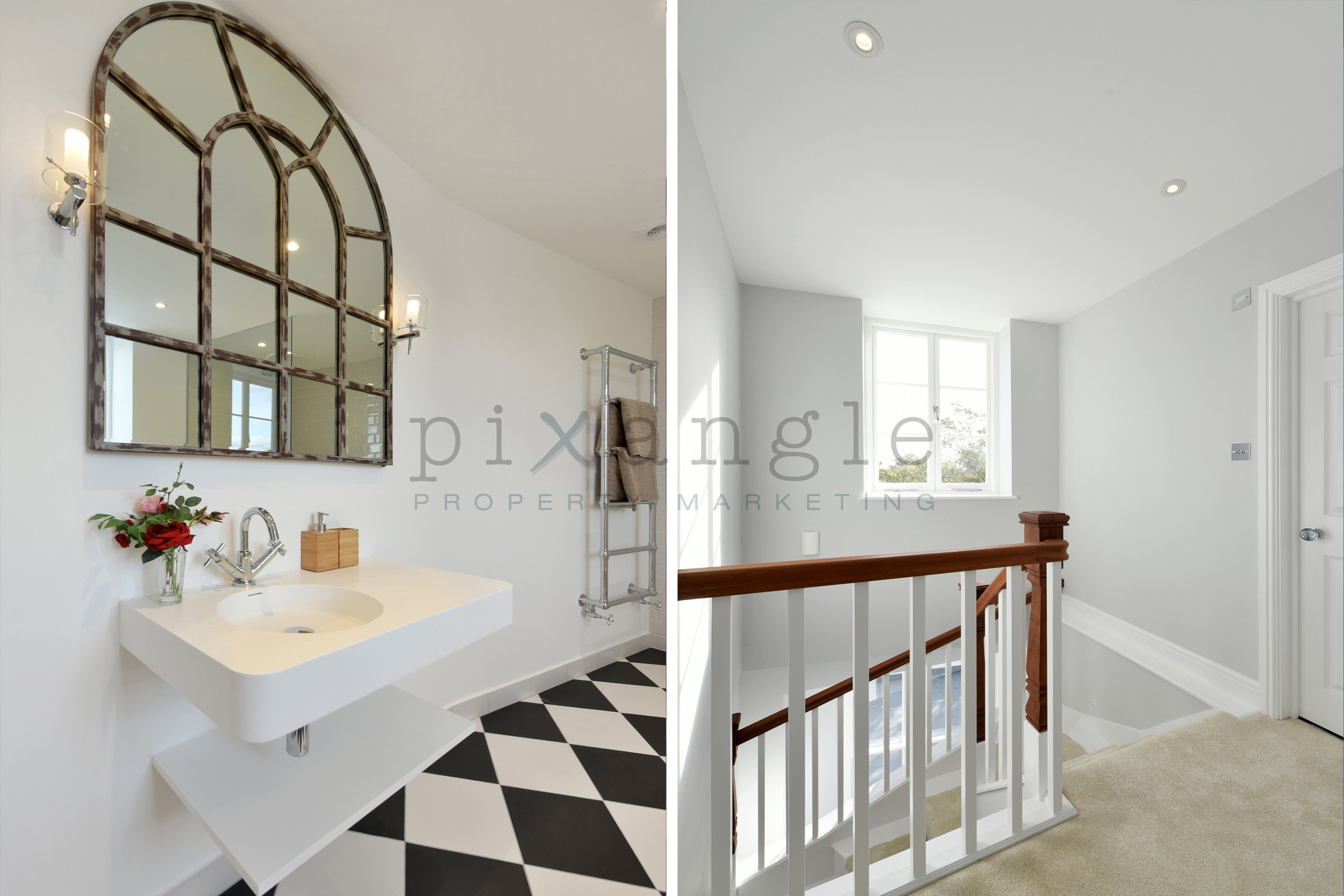
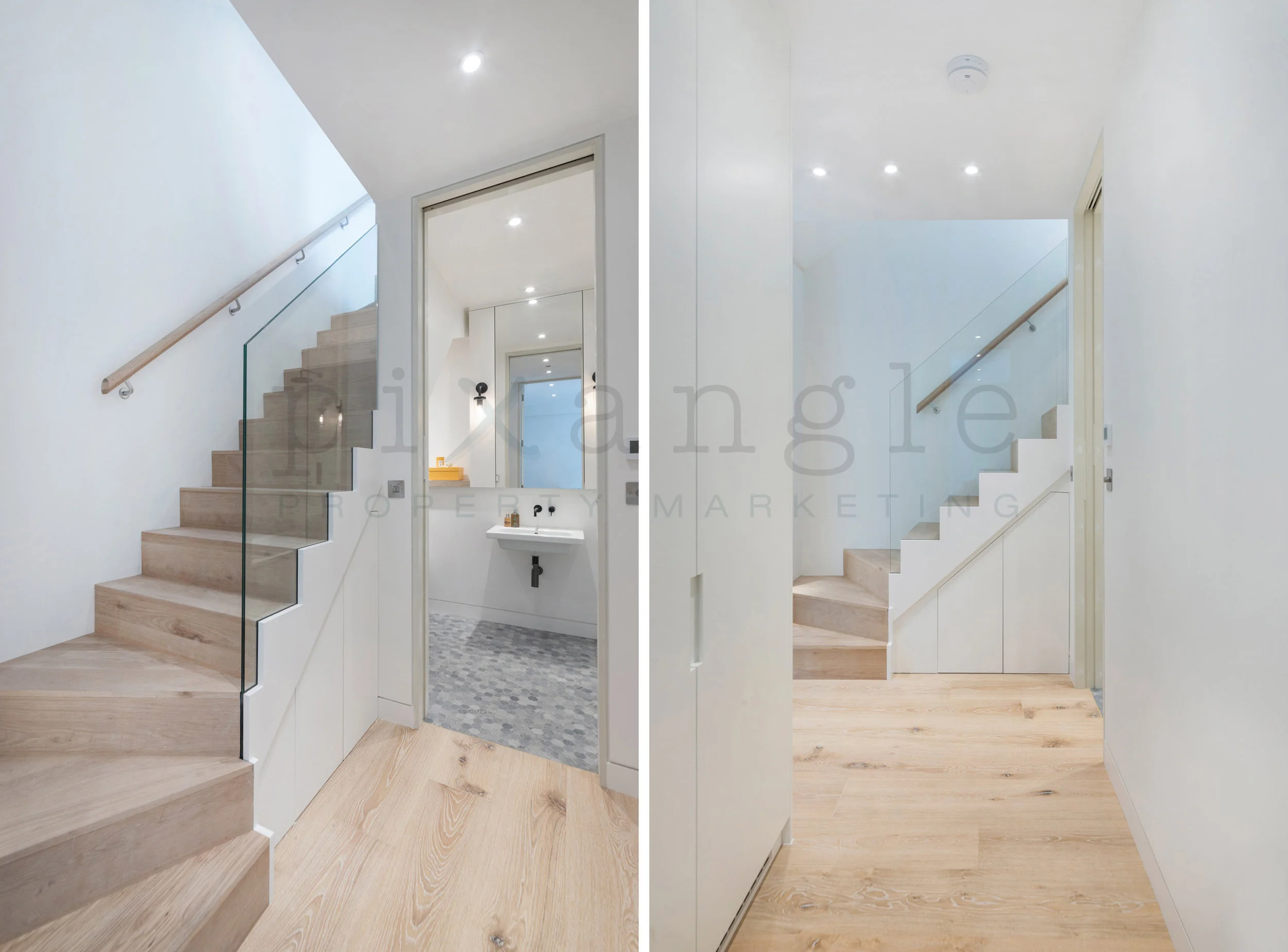
4. A "Stairway to Heaven" caption is far too cliched, but the serene white walls and the very pale, bleached wood accentuated by the very white spotlights certainly feels at least a little bit celestial. Placing the two angles of the staircase side by side is a nice way of giving it context within the property. It also gives an illusion of movement around the home, and we love the feeling of peeking round the corner into the bathroom.
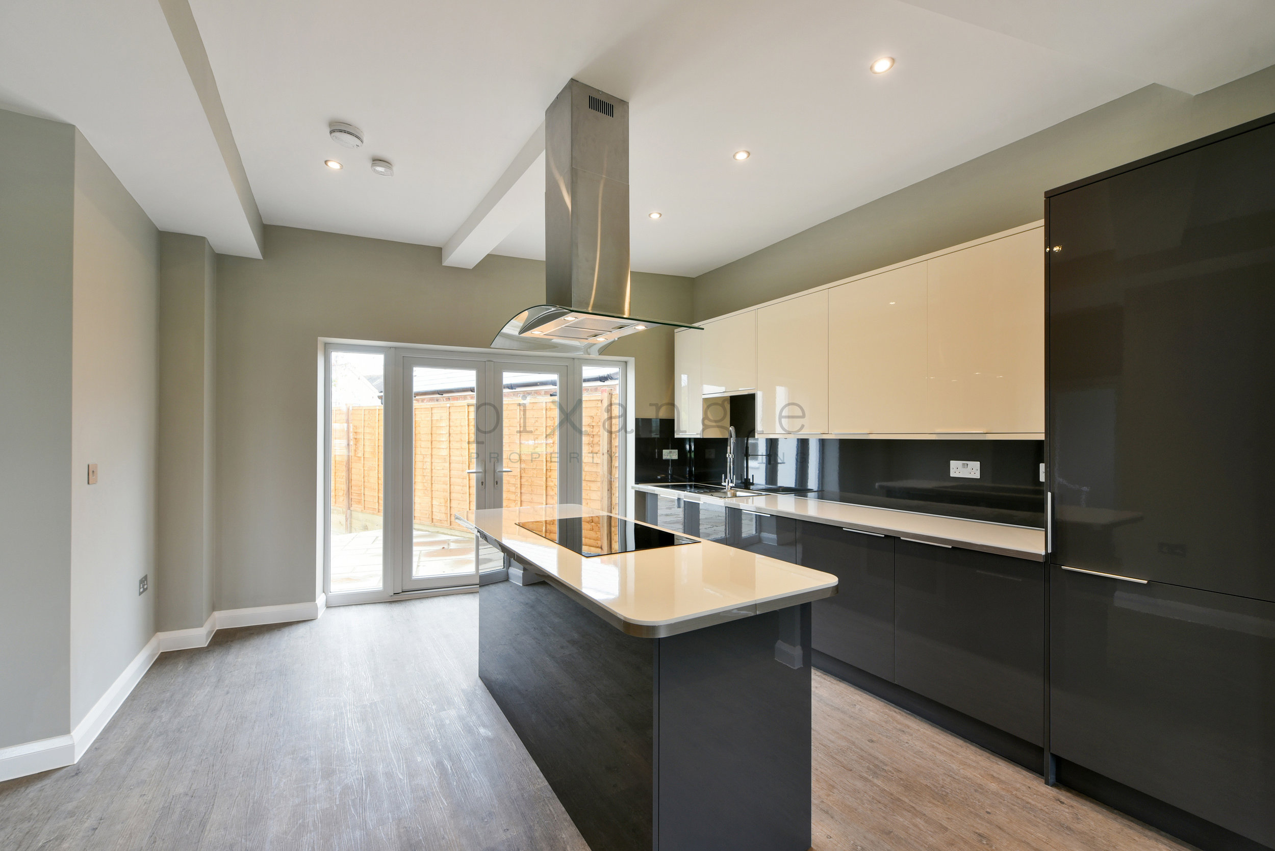
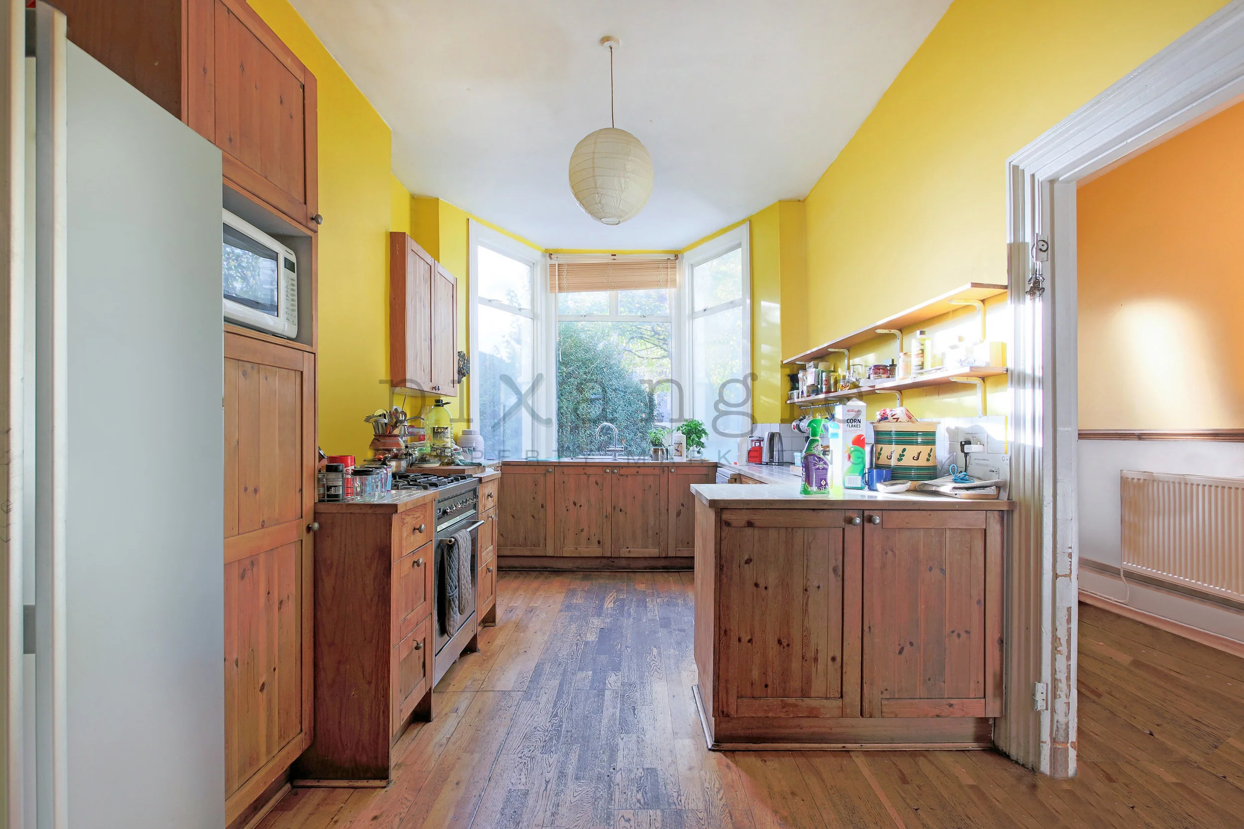
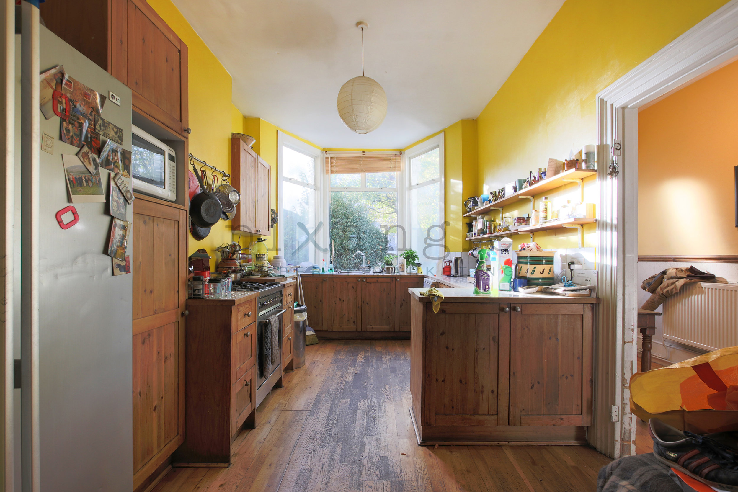
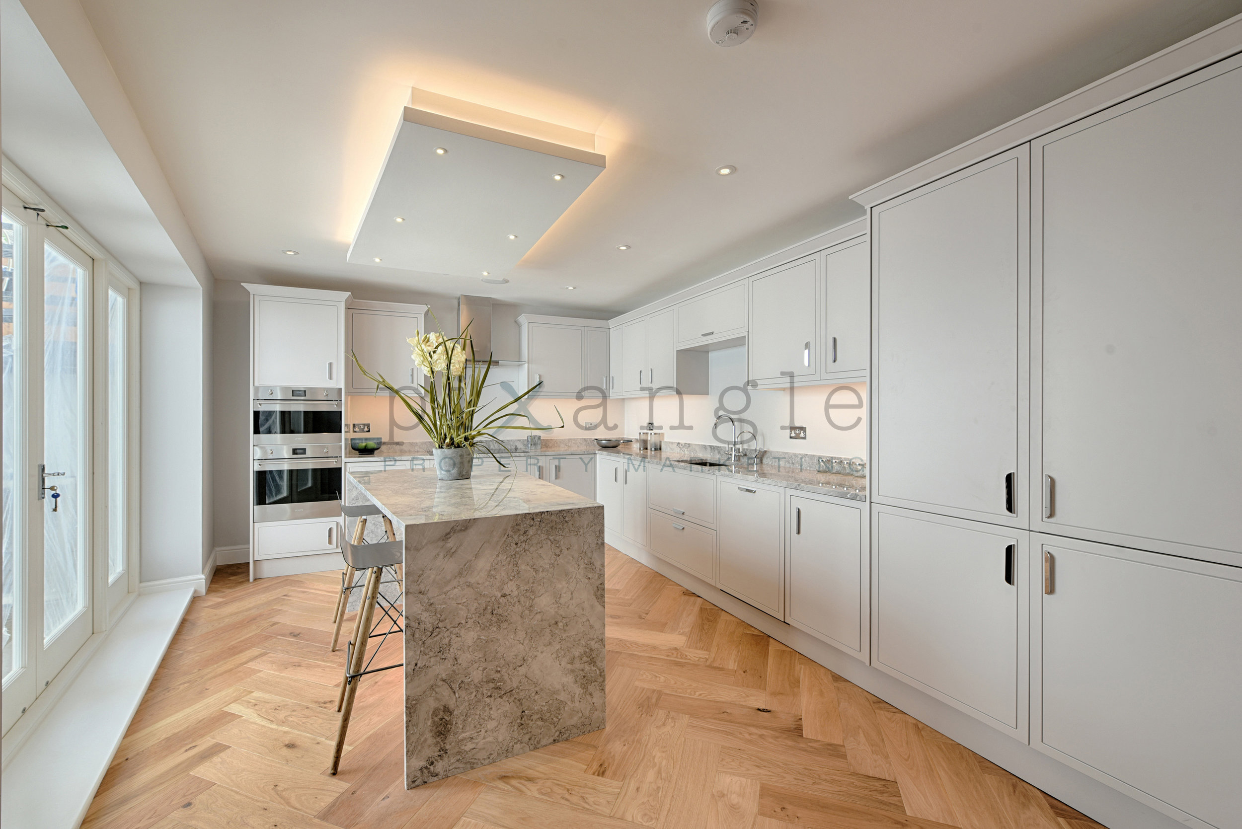
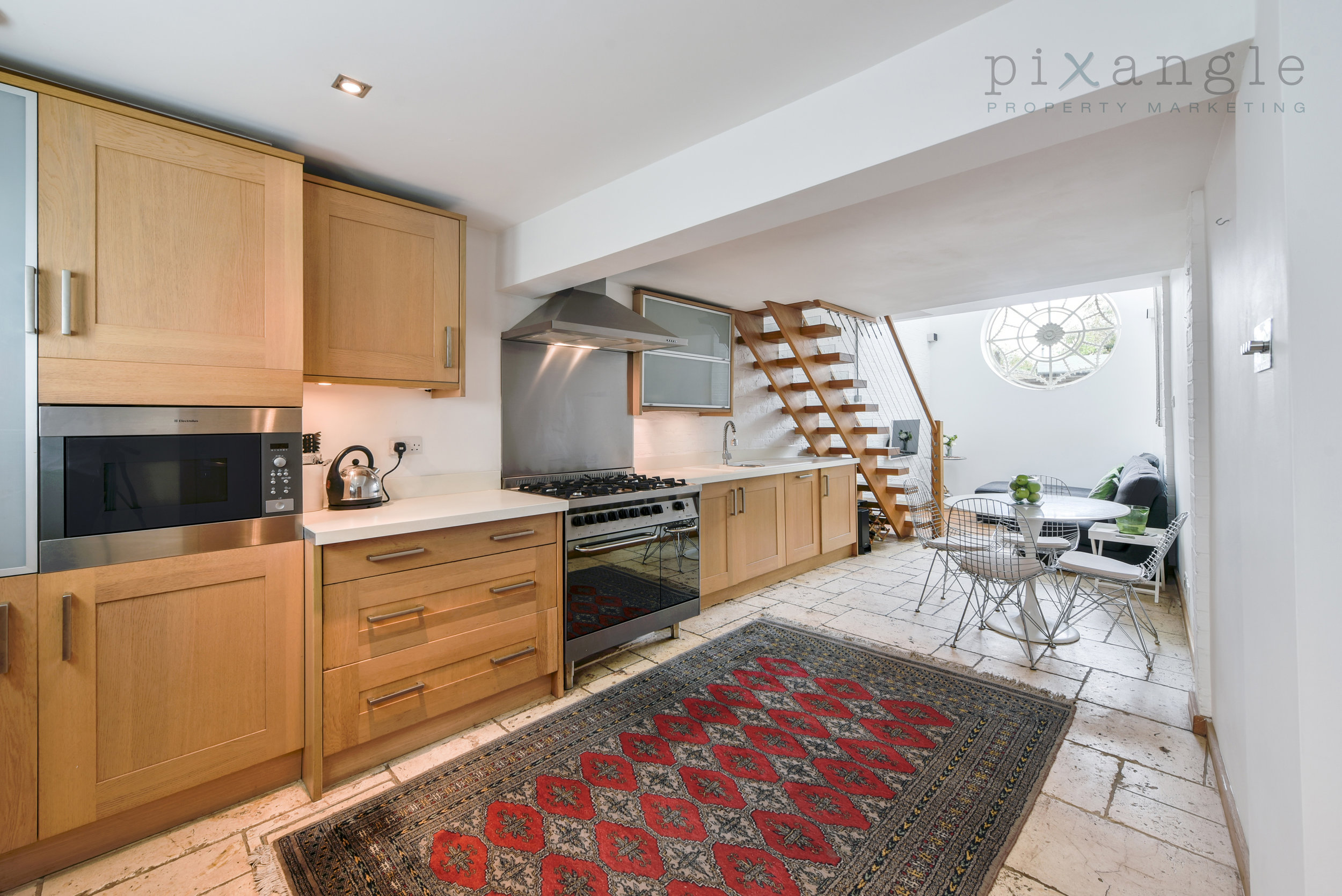
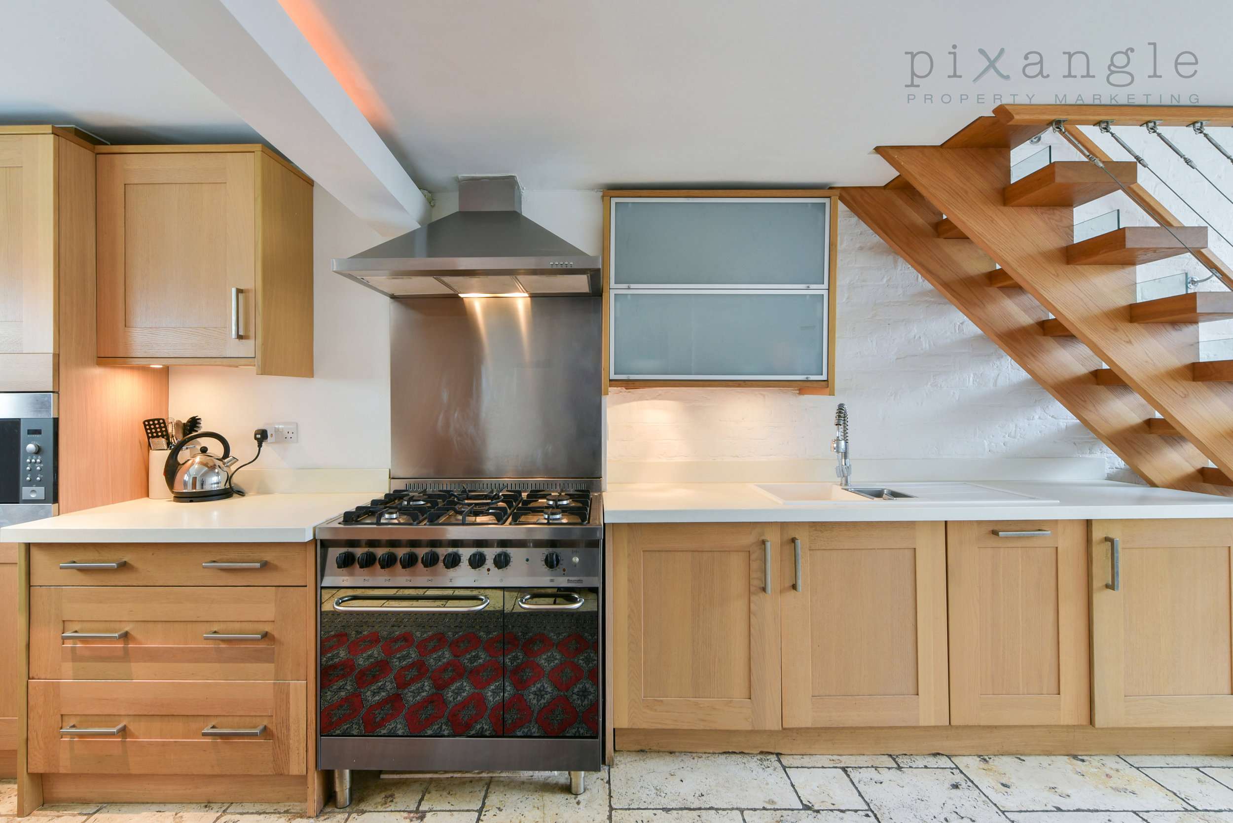
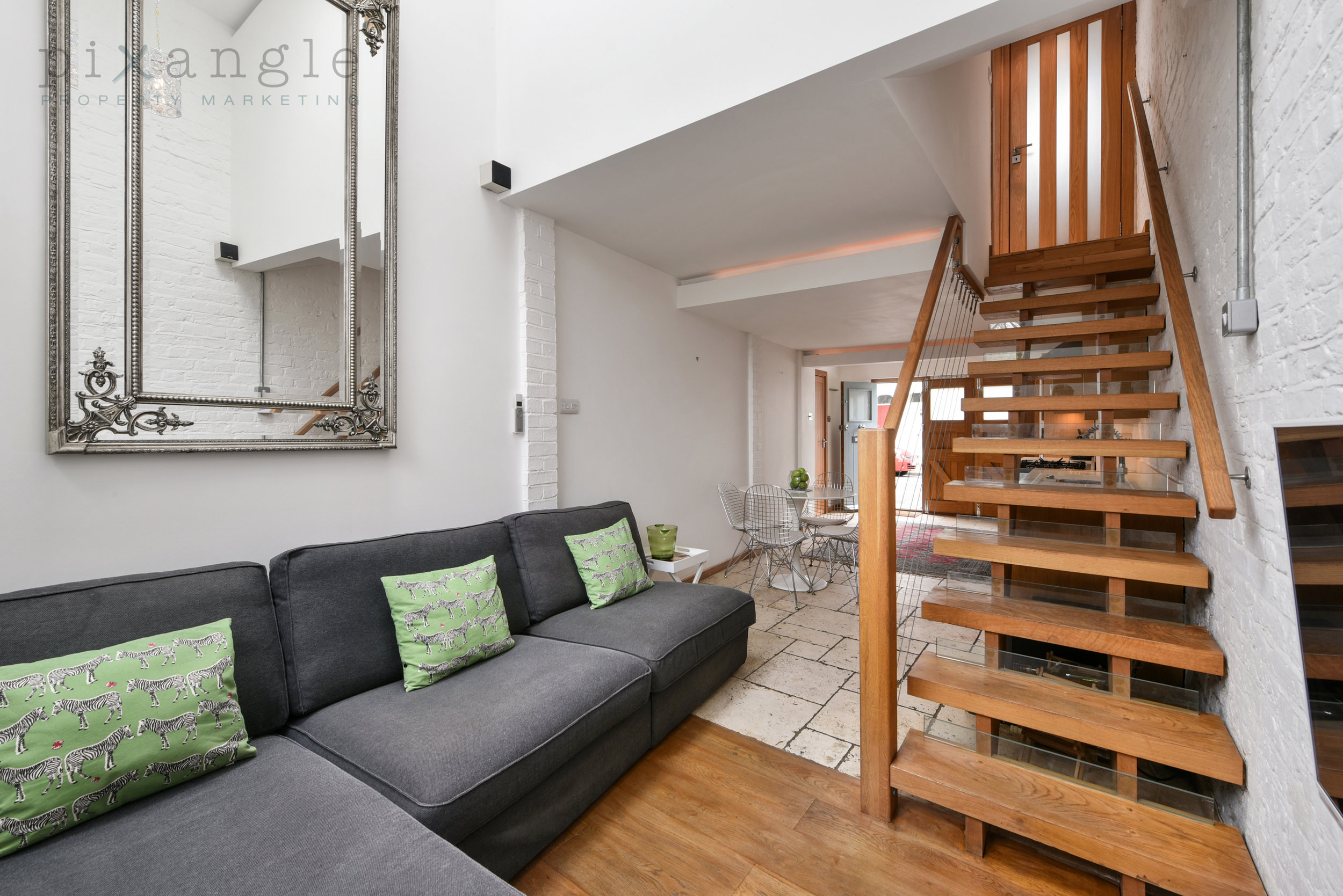
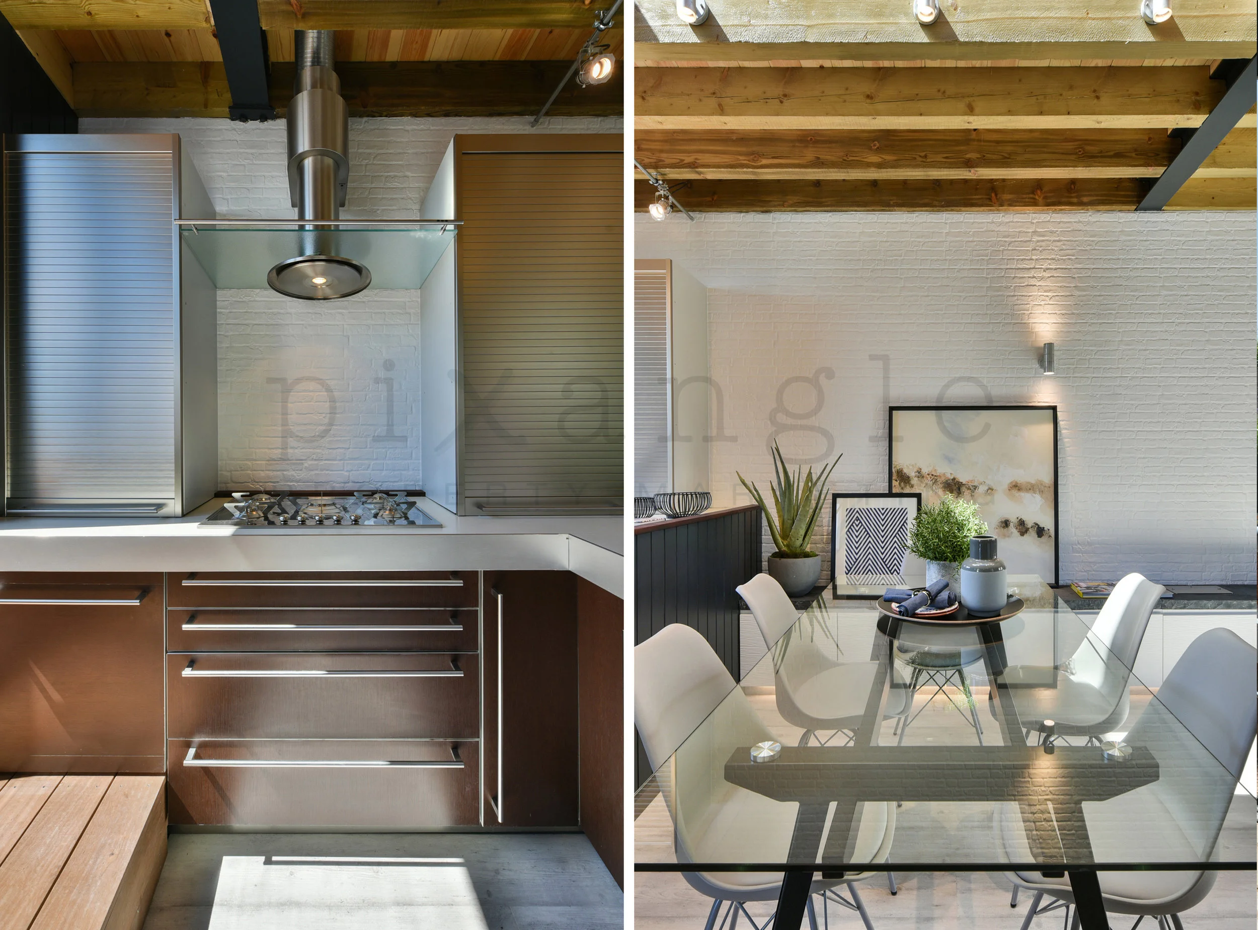
5. Portrait angles were particularly useful for both these shots in order to frame the subjects. In both cases, they functioned as "feature shots", focusing on the hob flanked by kitchen cupboards and table and chairs respectively, and they just wouldn't have been as effective as landscape, wide-angled shots. We think they sit very nicely side by side, especially since, as you can see on the far left of the right-hand shot, the kitchen is indeed next to it, just out of view.
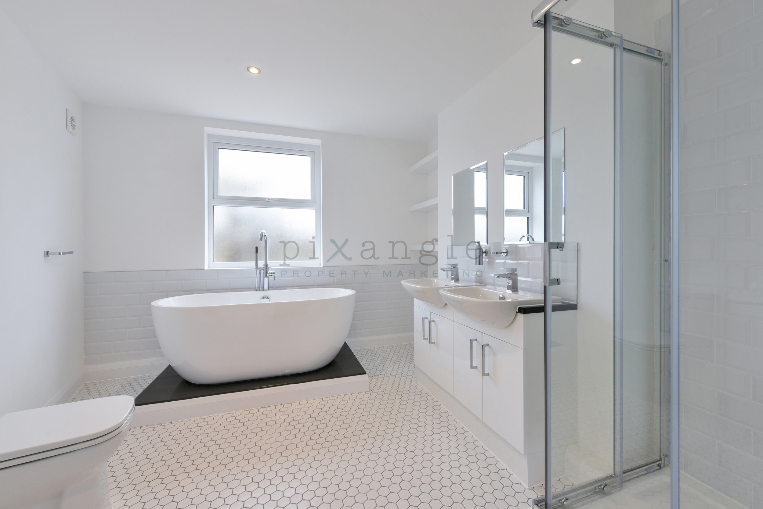
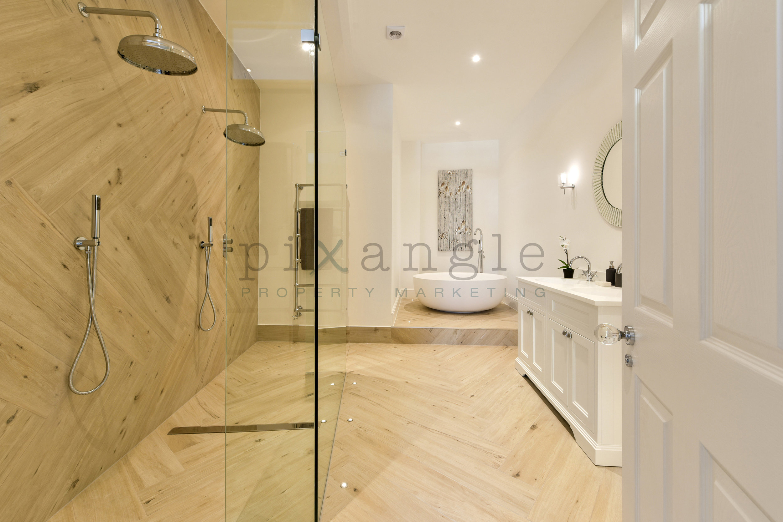
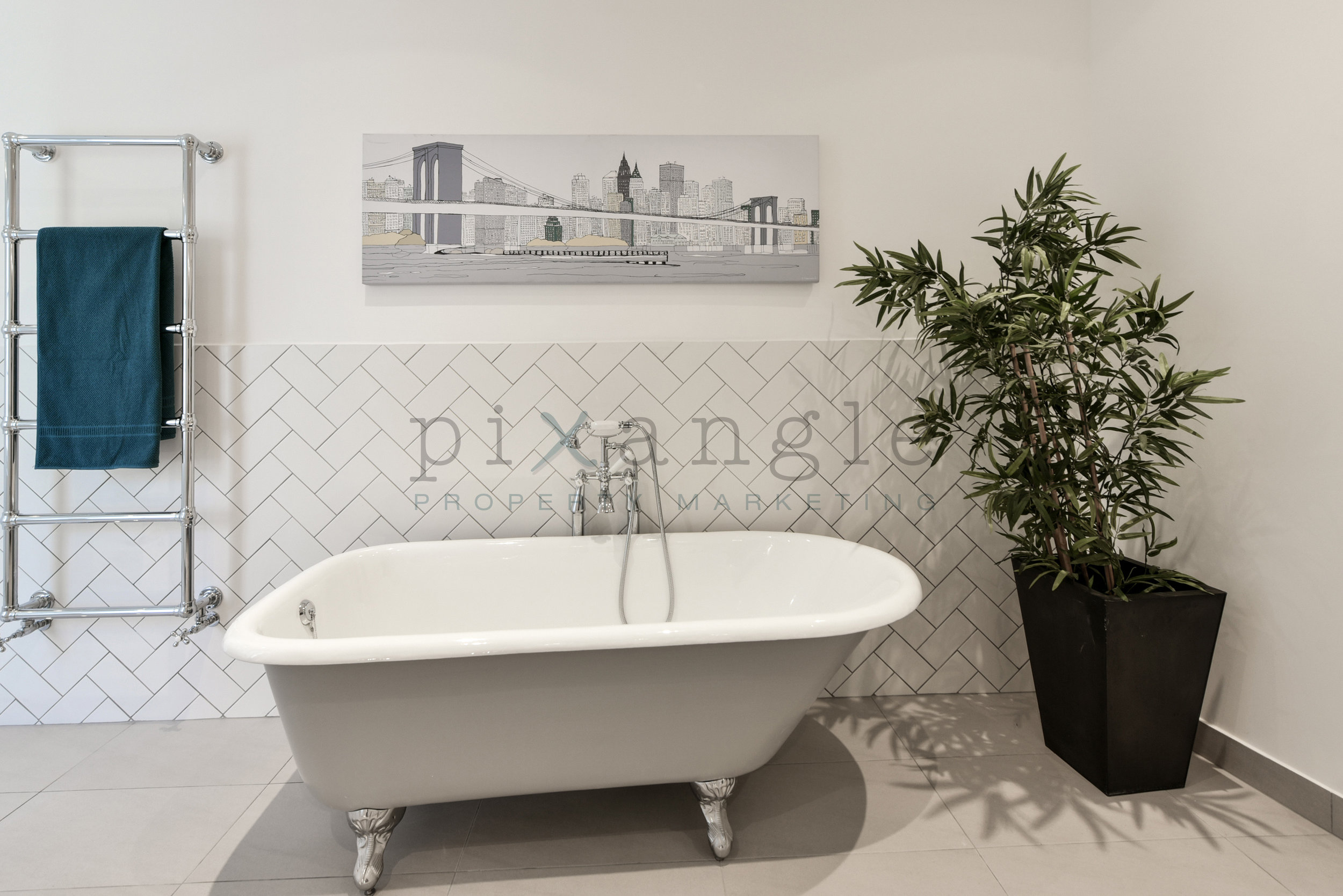
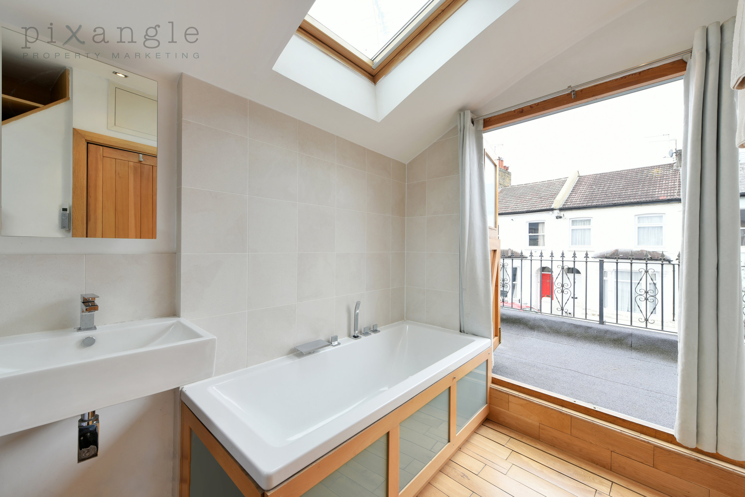
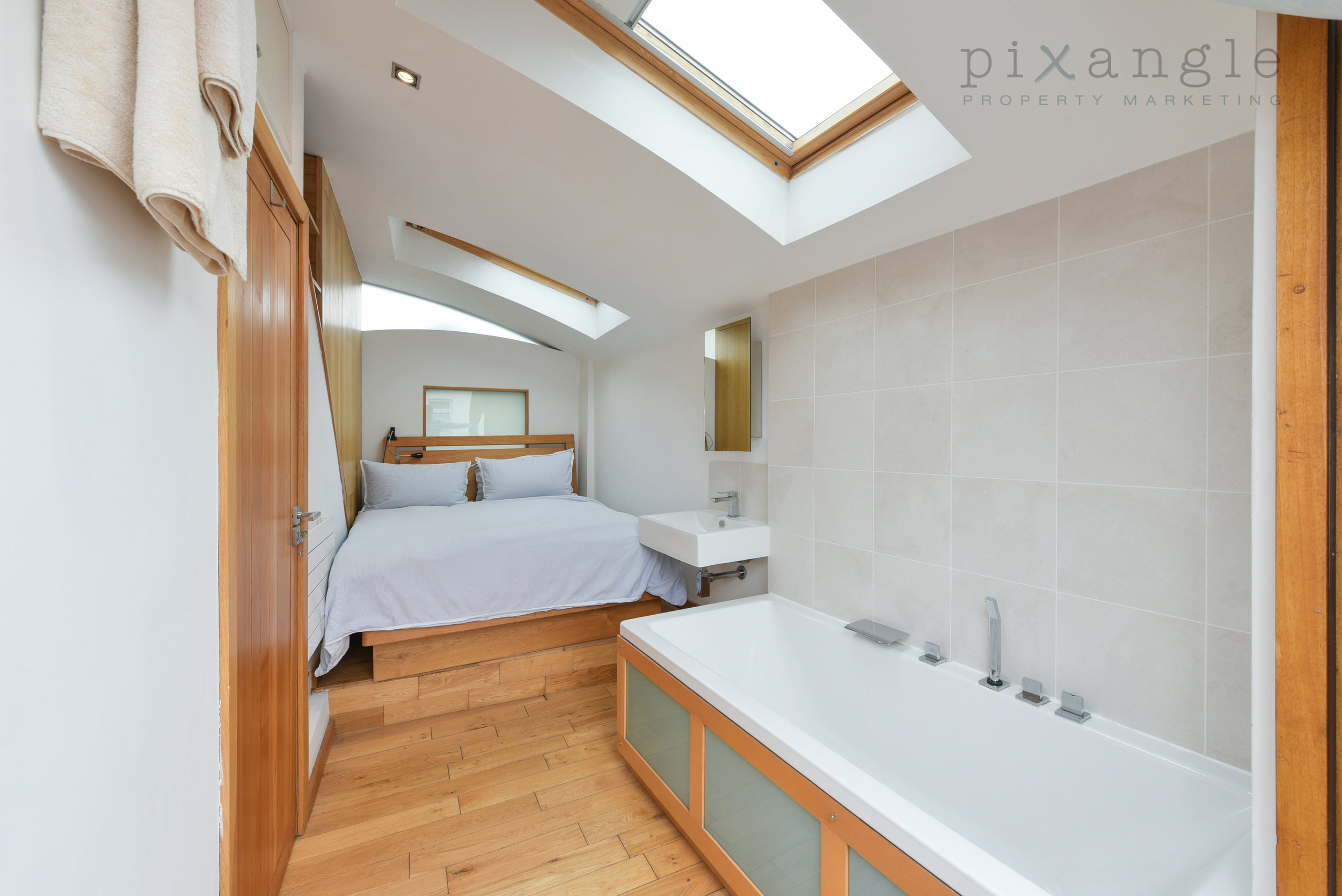
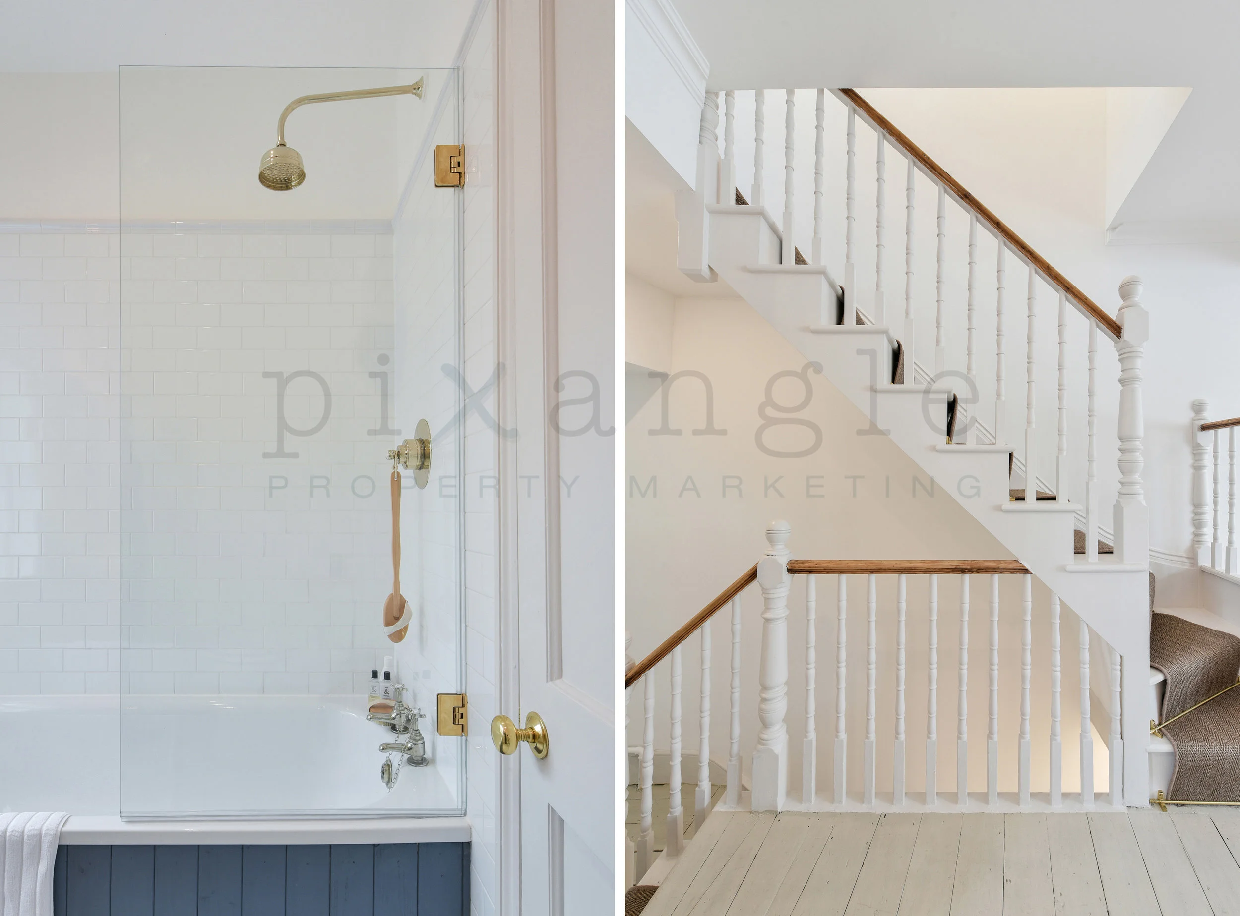
6. Showers are great to feature in portrait. In landscape shots of bathrooms, particularly small ones, tops or bottoms of showers can easily be cut off. This gives us the opportunity to show the full screen, the shower head, the bath taps and the bath itself, which in this case is the main feature colour in the bathroom and contrasts really nicely with the brass fixtures.
And just look at that staircase. This flat was a beautifully refurbished period property marketed by Haus, and it made excellent use of the period features, such as the delicate spindles.
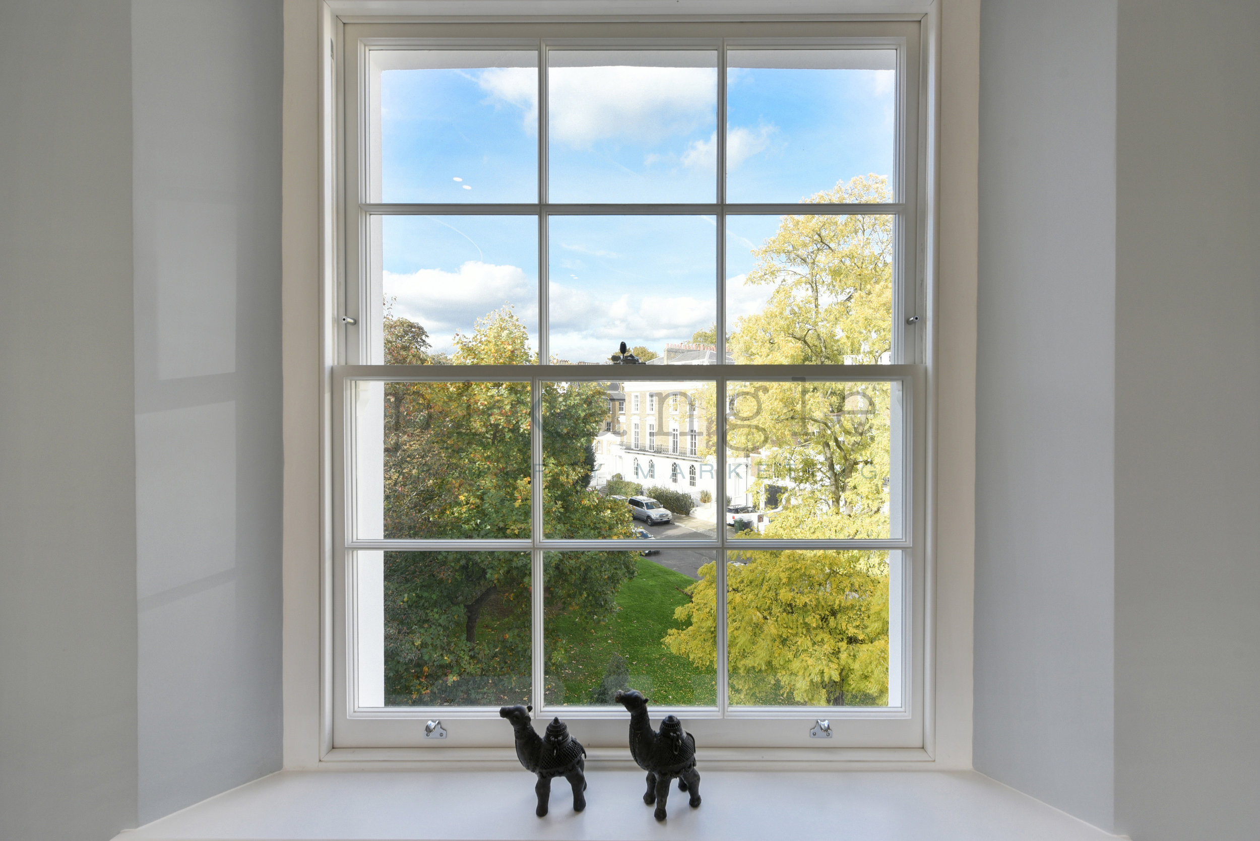
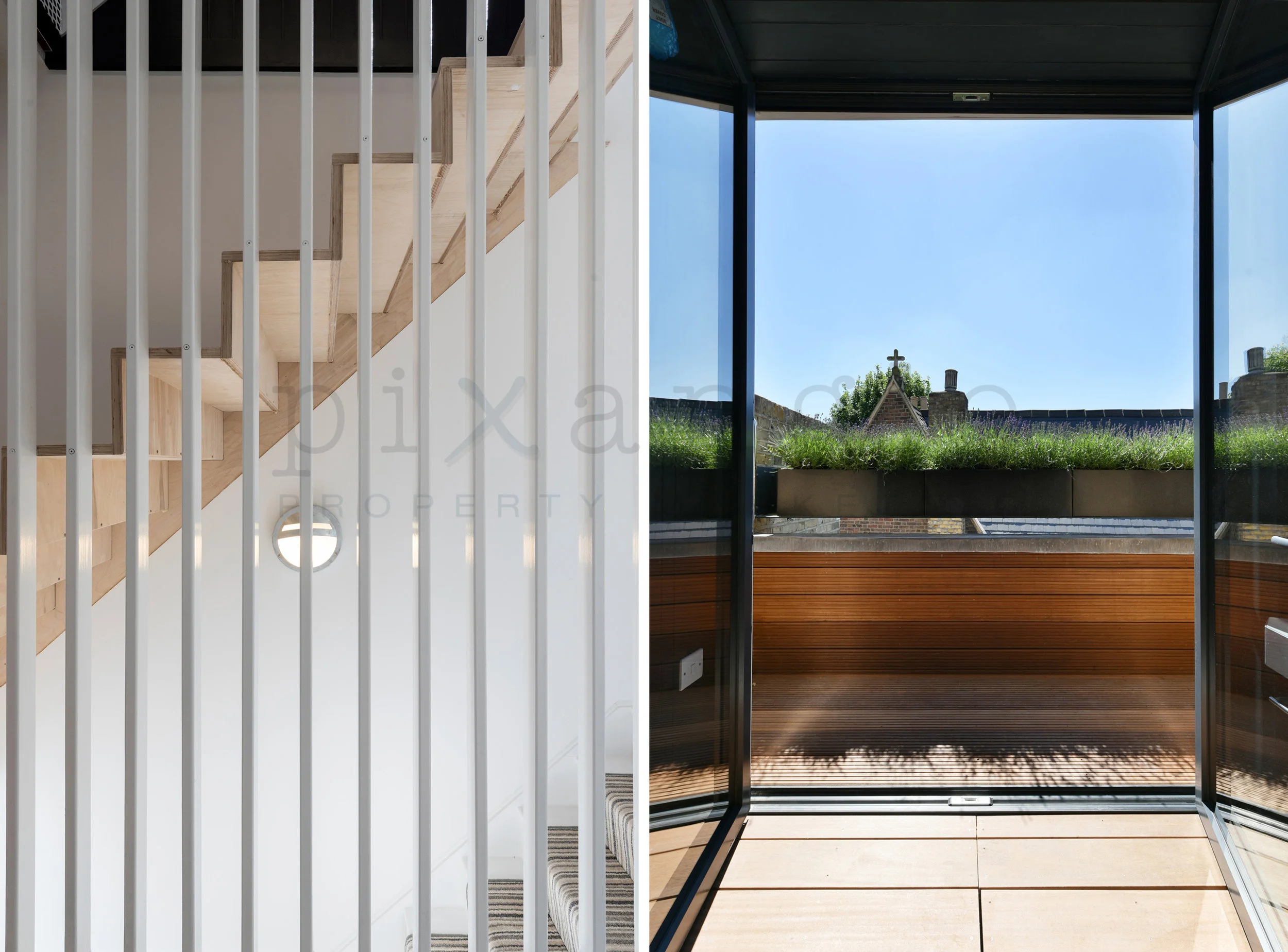
7. While we're talking features, what about this combination? We went for contrast here: Light and dark, pale and bright, interior and exterior.
The dual staircase on the left was perfect for this orientation, as it showed off the split level well and the vertical room partitions accentuated the angle. And the portrait shot on the right perfectly matched the portrait-shaped window, beautifully framing the peaceful view.
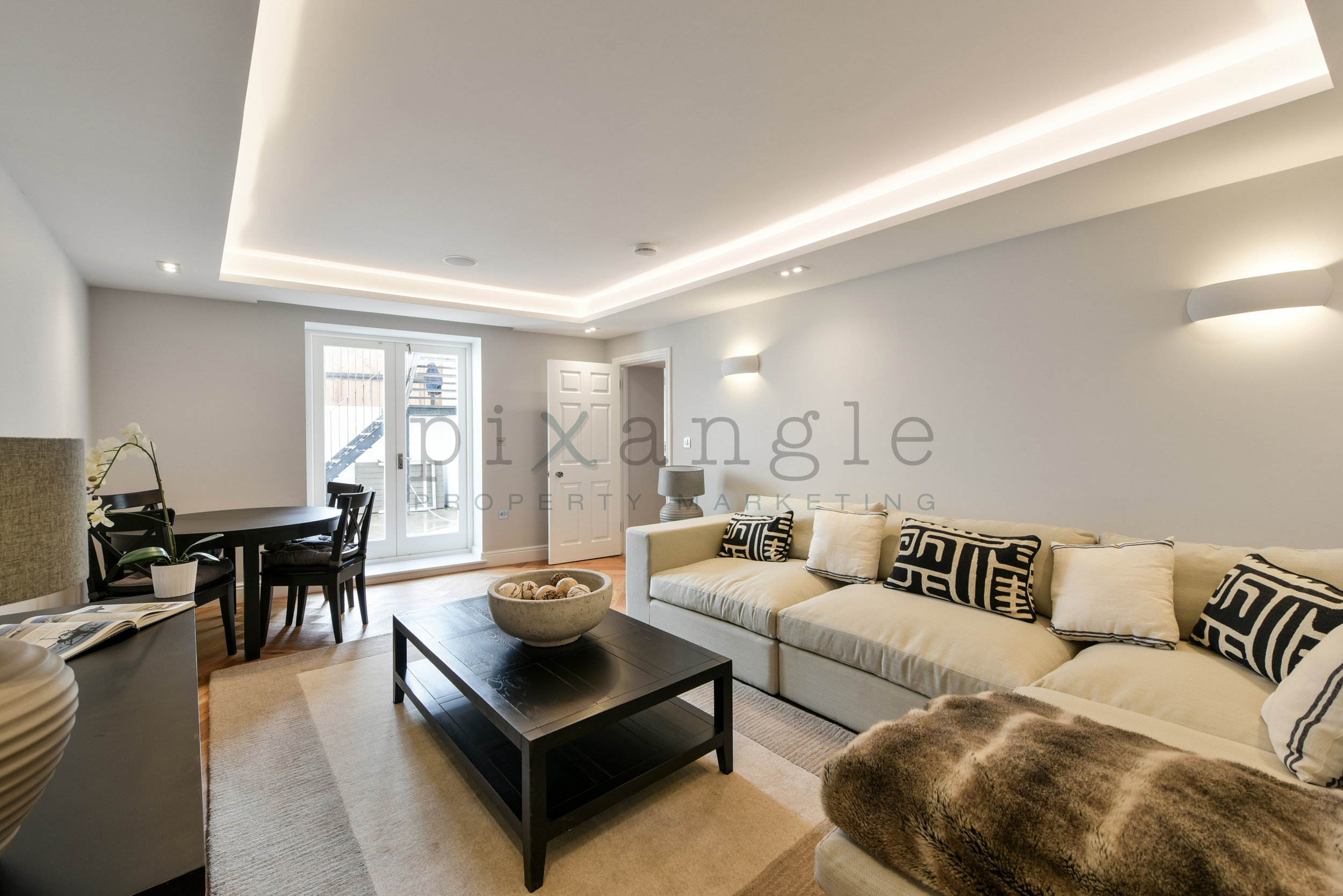
8. Ooh, a triple split! We loved this one because the property in question was designed by The Furniture Union, and they went for a handily matching colour theme throughout: Clear whites, soft browns and, in other rooms, deep soft greys and blues. Therefore we found feature splits really good for this place, especially since the inbuilt storage was worth showing off. Placing the bathroom shot in the middle, we were able to infuse light into the overall image.

9. Greenery! And some impressive use of glass over a light well to make a lower ground / basement level as bright as possible. The shot on the right is a fine example of when portrait photography is the best option: When the lens is angled upwards towards a narrow gap. You'll never get that angle straight - and neither should you want to. The best thing to do is make the angles contrast with each other as much as possible, which we were able to do here with the patterned glass overhead.
We paired this with the kitchen shot on the right because so many of the colours matched well: The green of the plants, the grey-blue of the kitchen units and the patio door frame, and of course all that peaceful white.

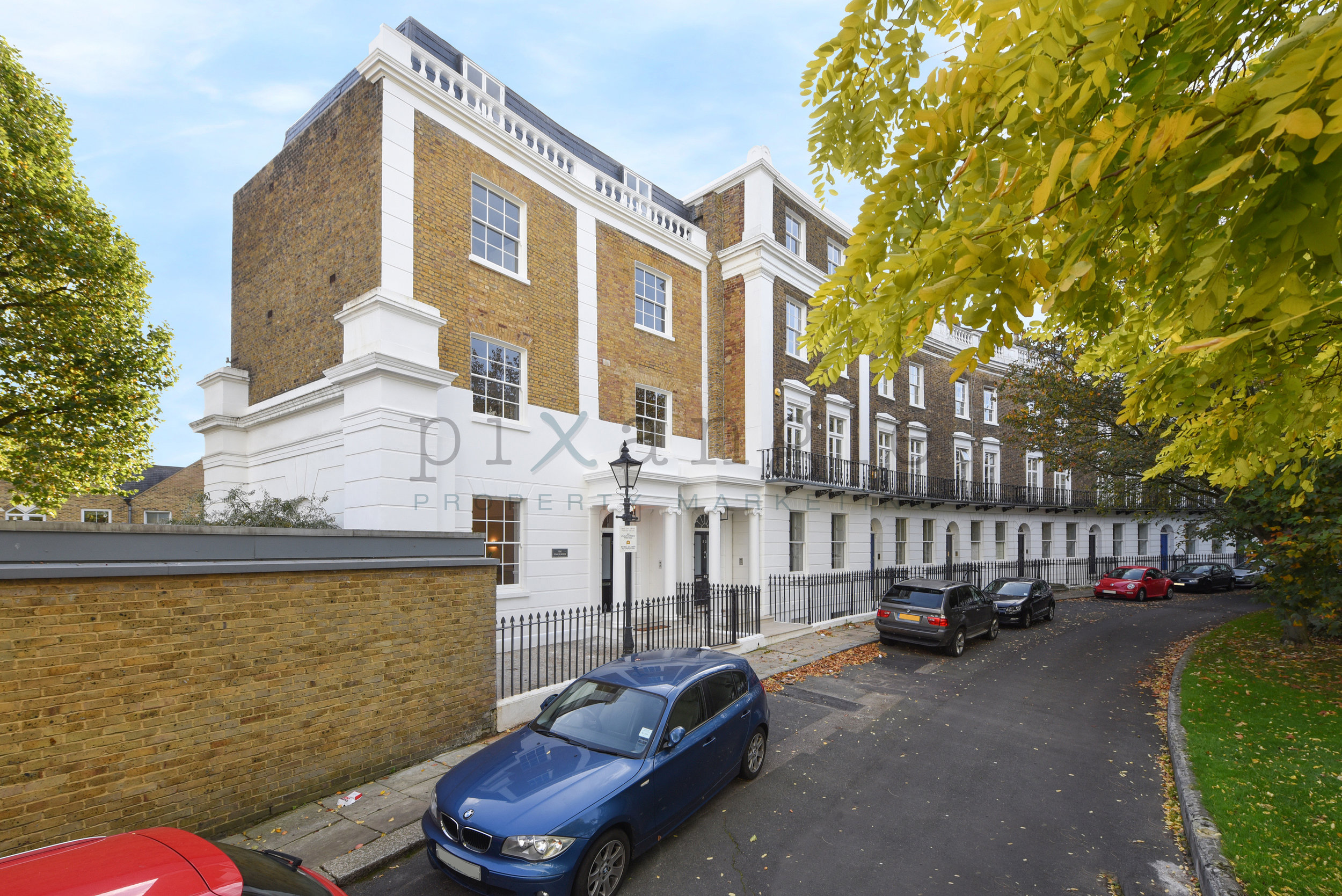
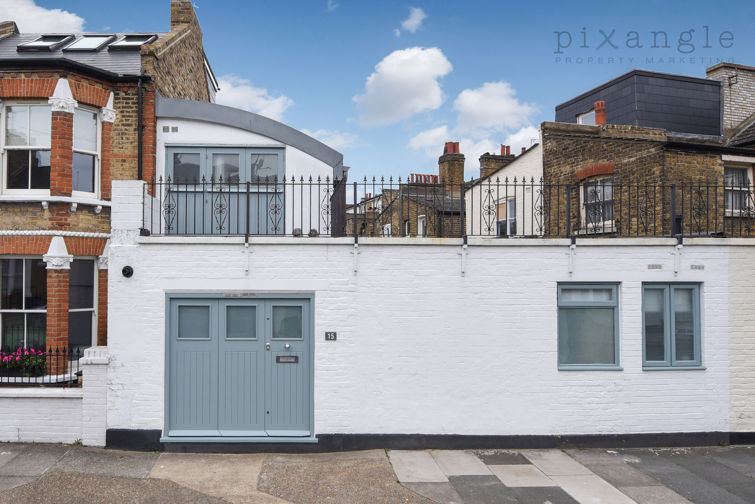
10. And an external for good measure. We shoot properties mainly in London, and if there's one thing London is full of, it's tall buildings. Portrait shots can be useful if there's a grand entrance to capture, or if you simply can't get far back enough to get enough of the building in in landscape without hitting another building behind you.
We've paired this entrance shot of a Battersea mansion block with a view of the building from its adjacent park to make use of the naturally complementary colours: the rich orangey-red of the brick and the deep greens of the surrounding foliage. And, of course, it never hurts to show off a good location!

We hope you've enjoyed our split-screen shots and are feeling photographically inspired!